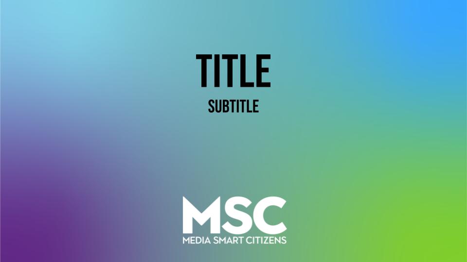
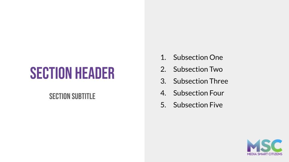
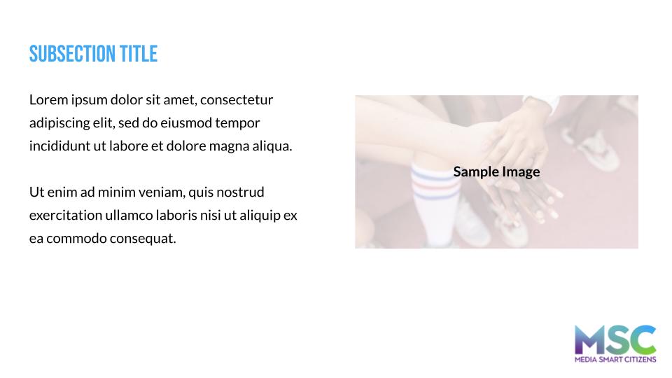
Developed a comprehensive brand identity including logo, color palette, and visual guidelines, then designed functional presentation templates and website layouts for Media Smart Citizens
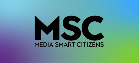
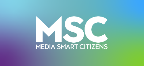
Established the primary brand mark and the core abbreviated and wordmark
forms so the initiative reads clearly at full scale and in supporting
applications.
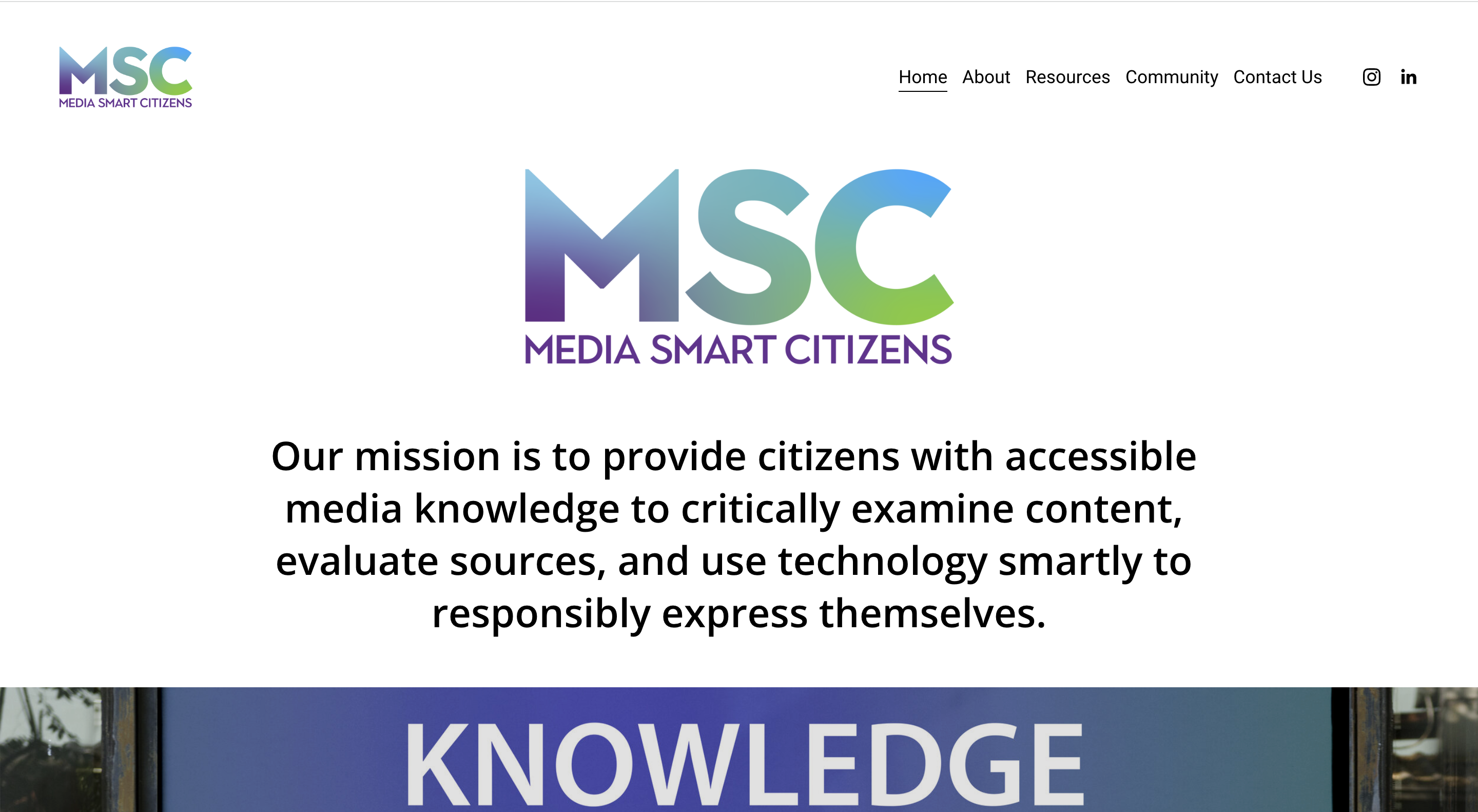
PRIMARY LOGO
LOCKUPS
Approved secondary marks sit below the primary logo: a monogram for
compact contexts and a dedicated wordmark for horizontal lockups.
Monogram mark for tight spaces, social avatars, and moments where a
short glyph reads faster than the full name.
Wordmark for headlines, horizontal layouts, and anywhere the full
initiative name should carry the voice of the brand.
II. BRAND GUIDELINES
SCOPE
Documented typography, color and gradient behavior, and approved lockup
variations so teams can implement the system without drifting off brand.
TYPOGRAPHY
Primary typeface in usePrimary typeface in use
Town type treatment sets the editorial voice for titles and display lines
across deck and web surfaces.
GRADIENT AND COLOR PALETTE
The gradient anchors the palette and signals motion and depth; paired
neutrals and accent hues support UI, print, and presentation layers.