Creation of campaign report infographics and a year-end holiday graphic card to support data-driven storytelling
2021
Data VisualizationInformation DesignVisual CommunicationContent Strategy
Tools | Google Sheets, Looker Studio, Adobe Illustrator, InDesign
I. CAMPAIGN REPORT INFOGRAPHICS
CONTEXT
Fulcrum Analytics needed campaign reporting artifacts that could be read quickly
by cross-functional stakeholders while preserving metric accuracy. The work
focused on converting raw performance data into clear narrative visuals for
recurring client communication.
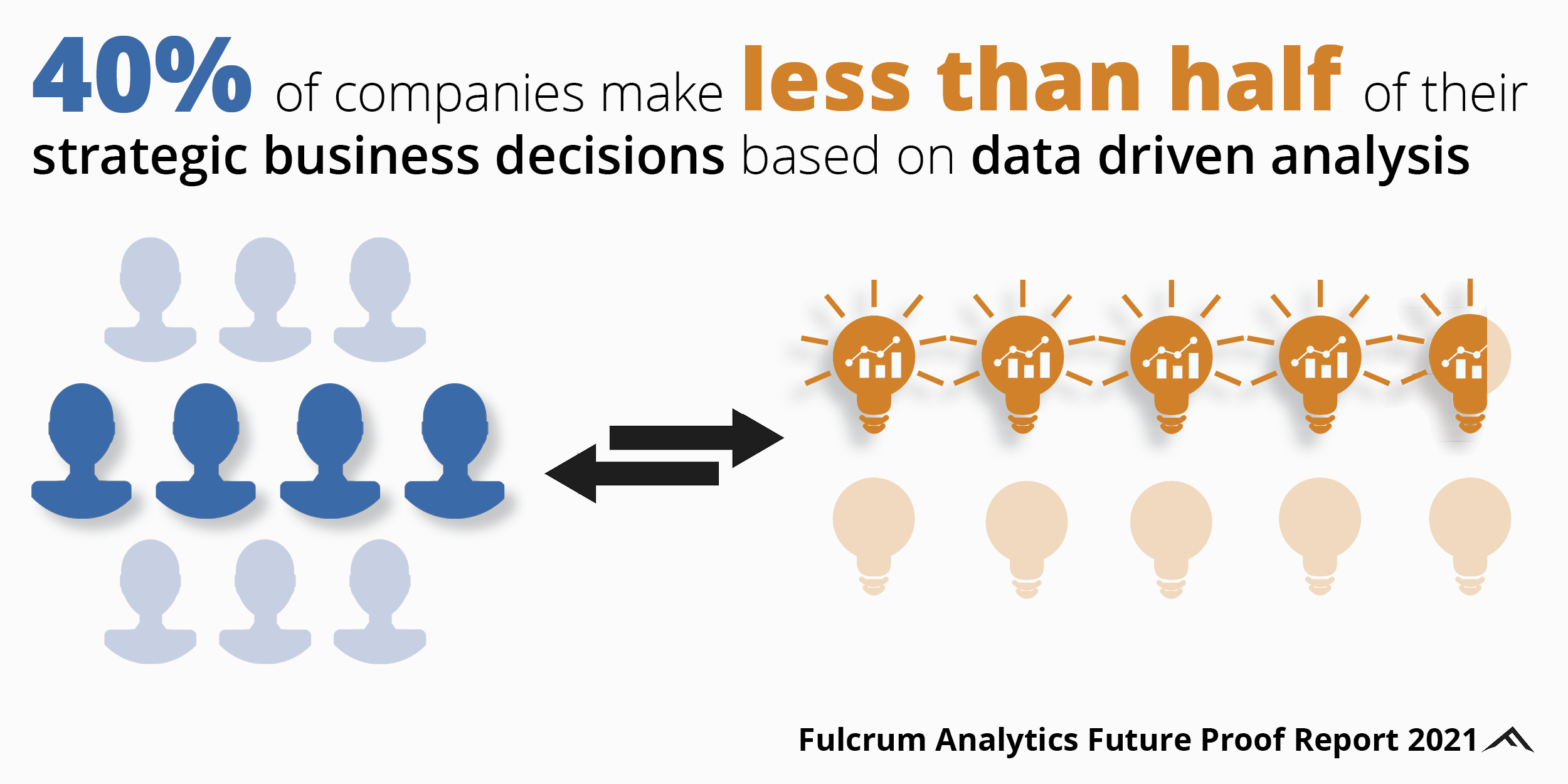
1. THESIS
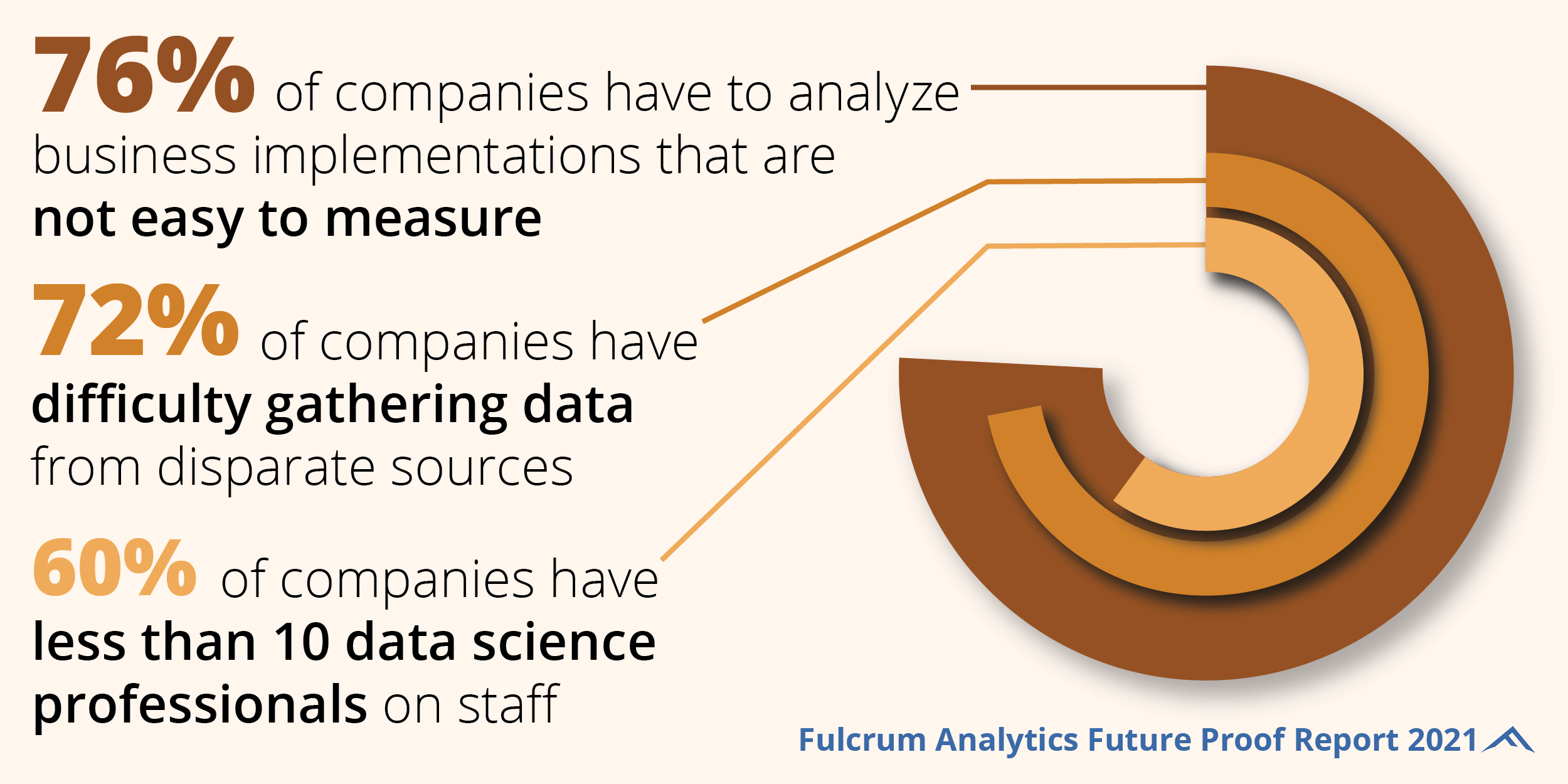
2. PROBLEM
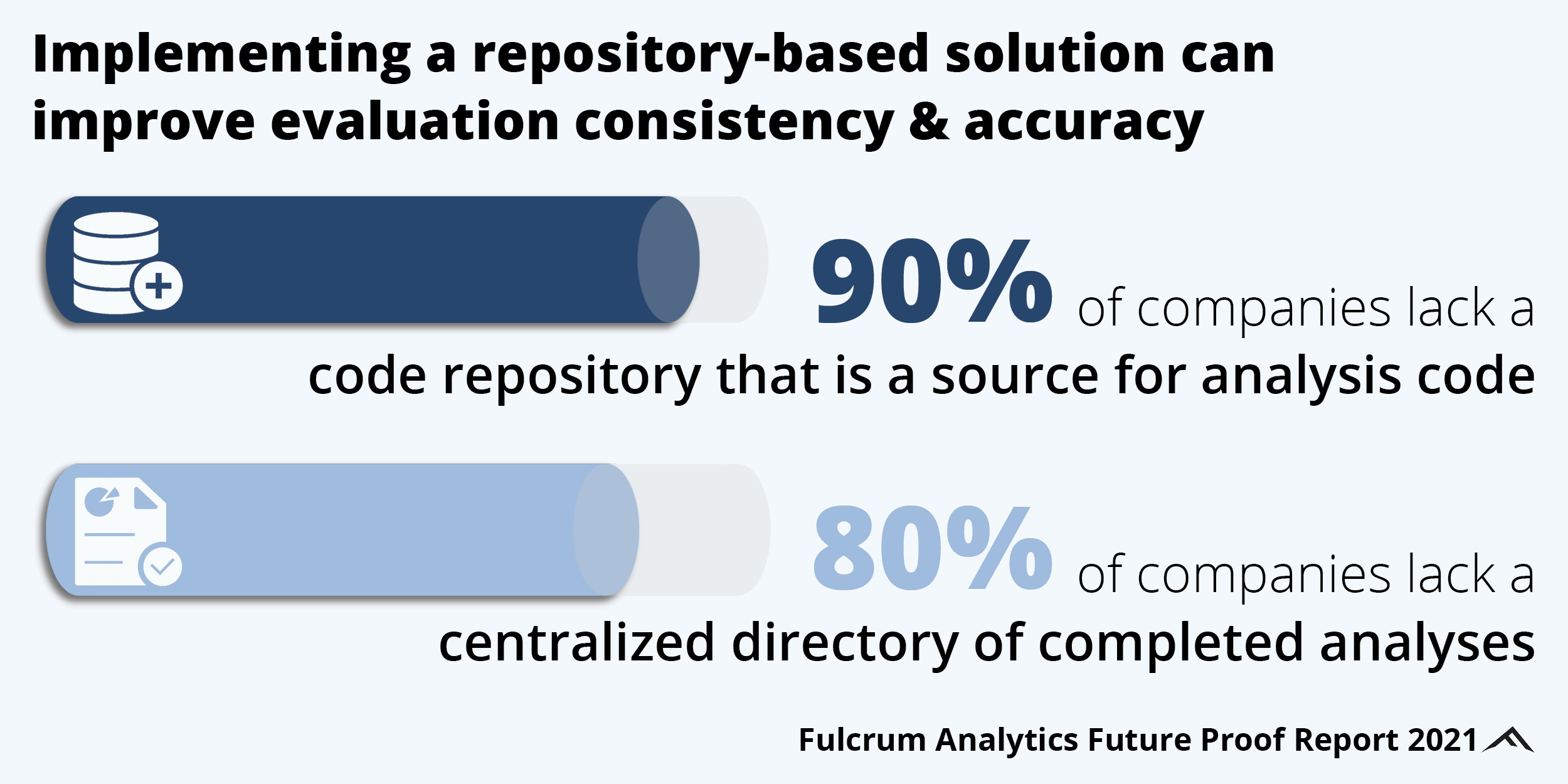
3. SOLUTION
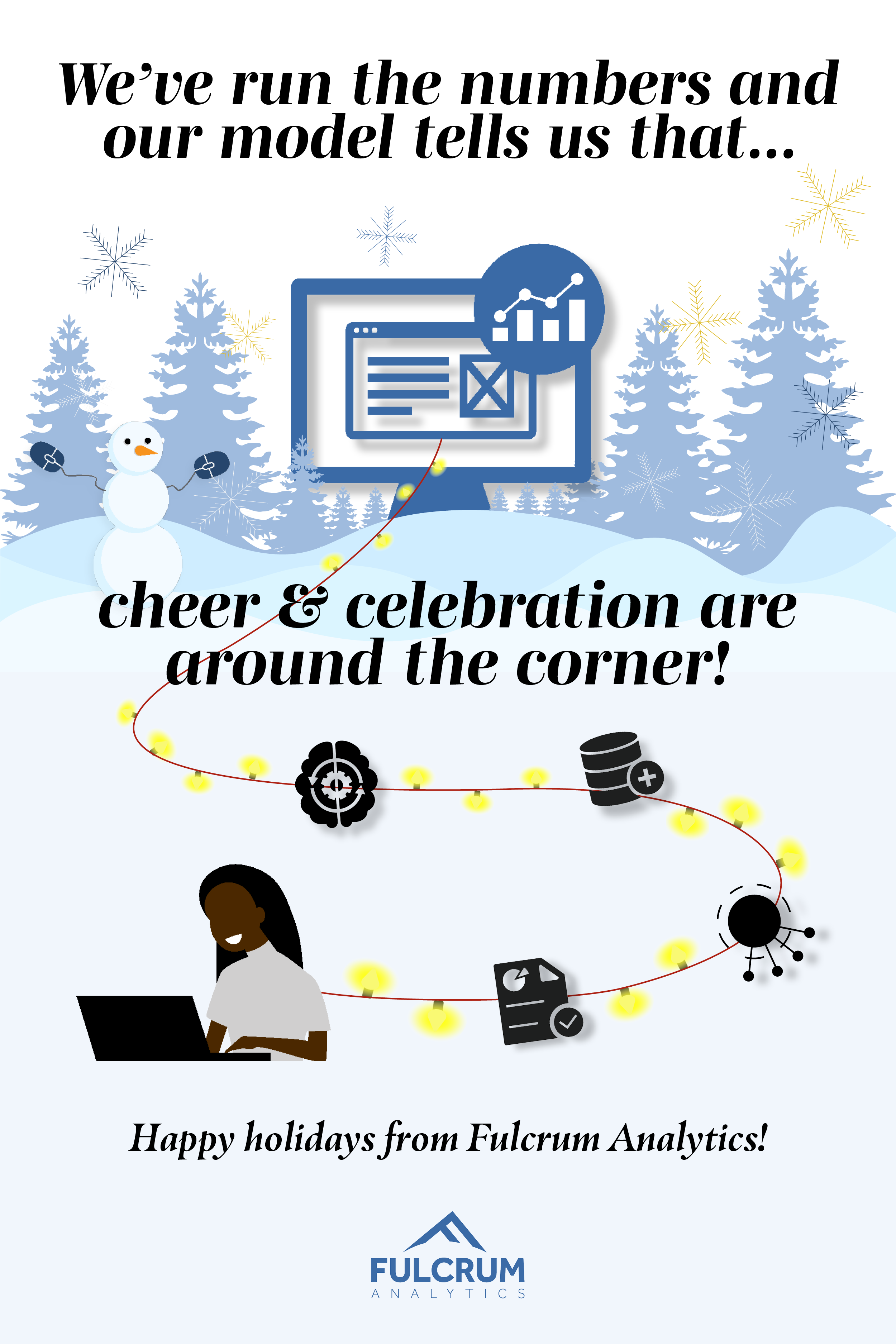
II. YEAR-END HOLIDAY CARD
STORYLINE
"Fulcrum's Data-Driven, Meaningful Outputs"
The card follows a simple narrative about creating meaningful outputs and capturing
the feeling of anticipation during the holiday season. A desktop computer surrounded
by snowy trees playfully reflects Fulcrum's continuous work through year-end. A person
running analyses is connected to the computer through systems hanging on holiday lights,
symbolizing Fulcrum's data-driven approach.